

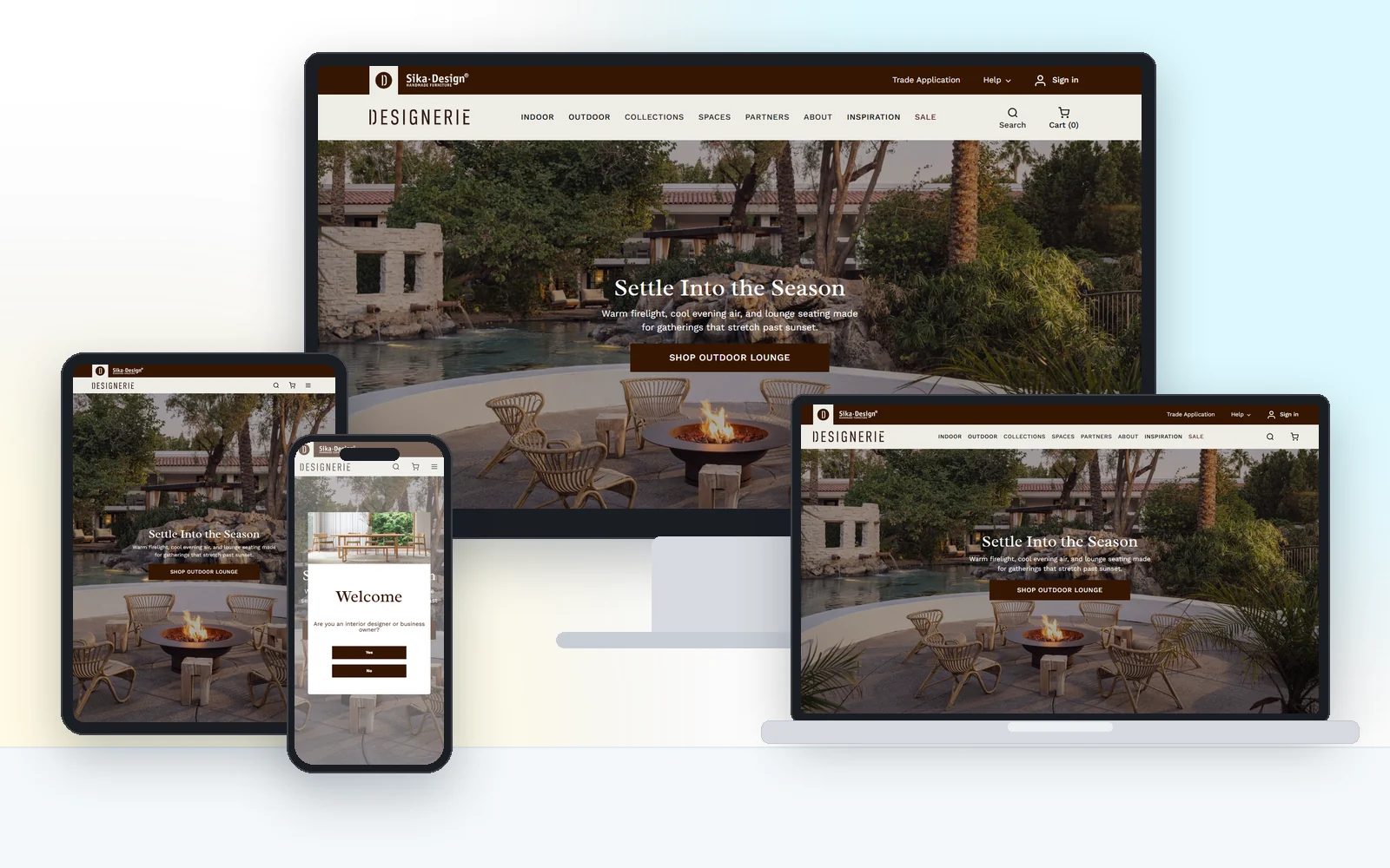
A premium storefront where the shopping experience feels as considered as the products, and checkout stays out of the way.
The challenge
For a design-led brand, an off-the-shelf store template undercuts the product. Typography, spacing, imagery and checkout all had to reinforce a sense of quality, while still turning browsers into buyers.
What we built
We built a refined storefront with a restrained visual system that lets product photography breathe. Product pages, cart and checkout were designed to remove hesitation, the owner can update products and pages herself, and the whole store was tuned to load quickly so the experience never feels heavy.
The result
- Faster pages and fewer abandoned carts after the checkout rebuild
- A store the owner updates herself, without calling a developer
- Product pages engineered for clarity and conversion
- Fast, responsive shopping on every device
Desktop, laptop, tablet and phone
Real screenshots of the live site, not mockups. Every layout is designed for the small screen first, then scaled up.


They rebuilt our checkout and the difference was immediate: faster pages, fewer abandoned carts, and a store I can update myself. Honest advice too, they talked me out of features I did not need.