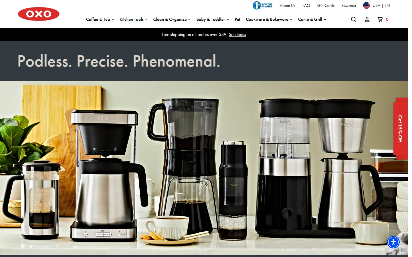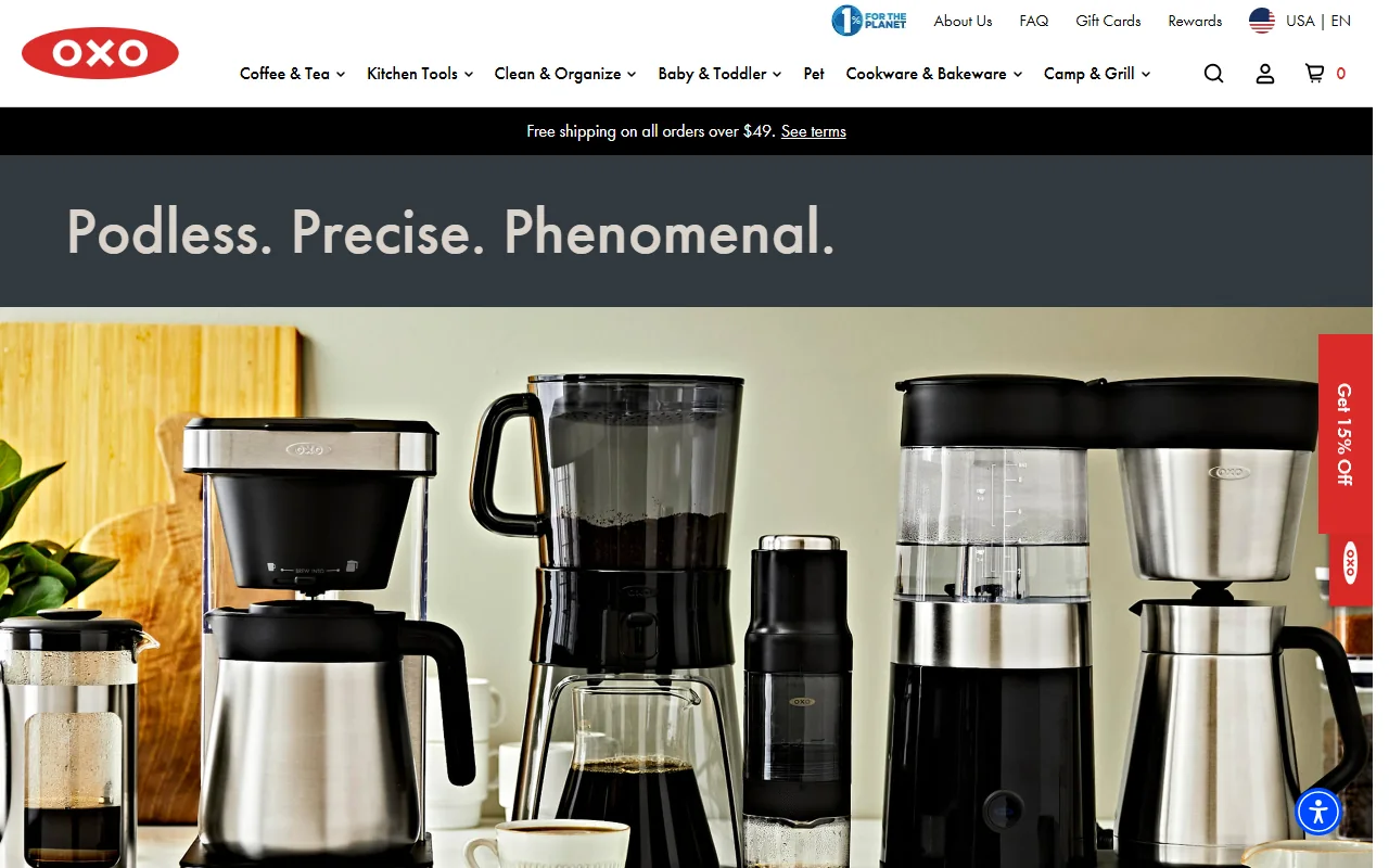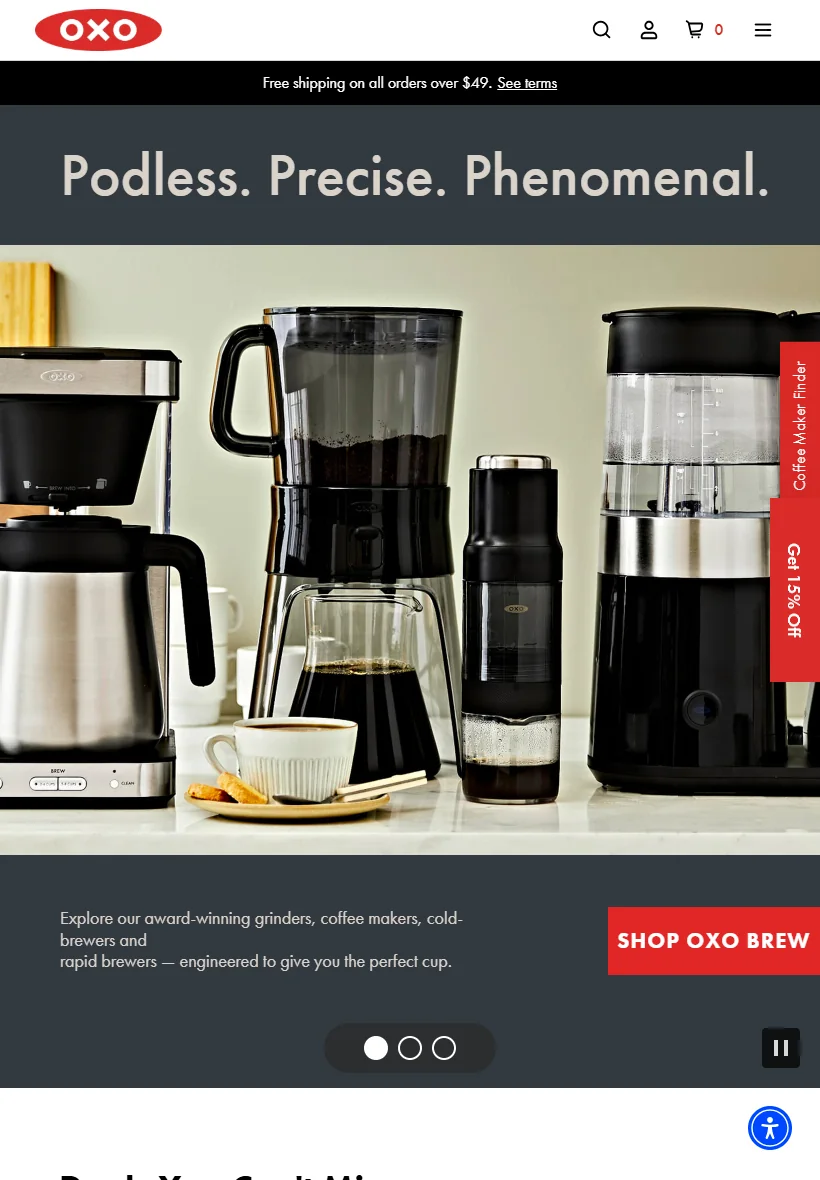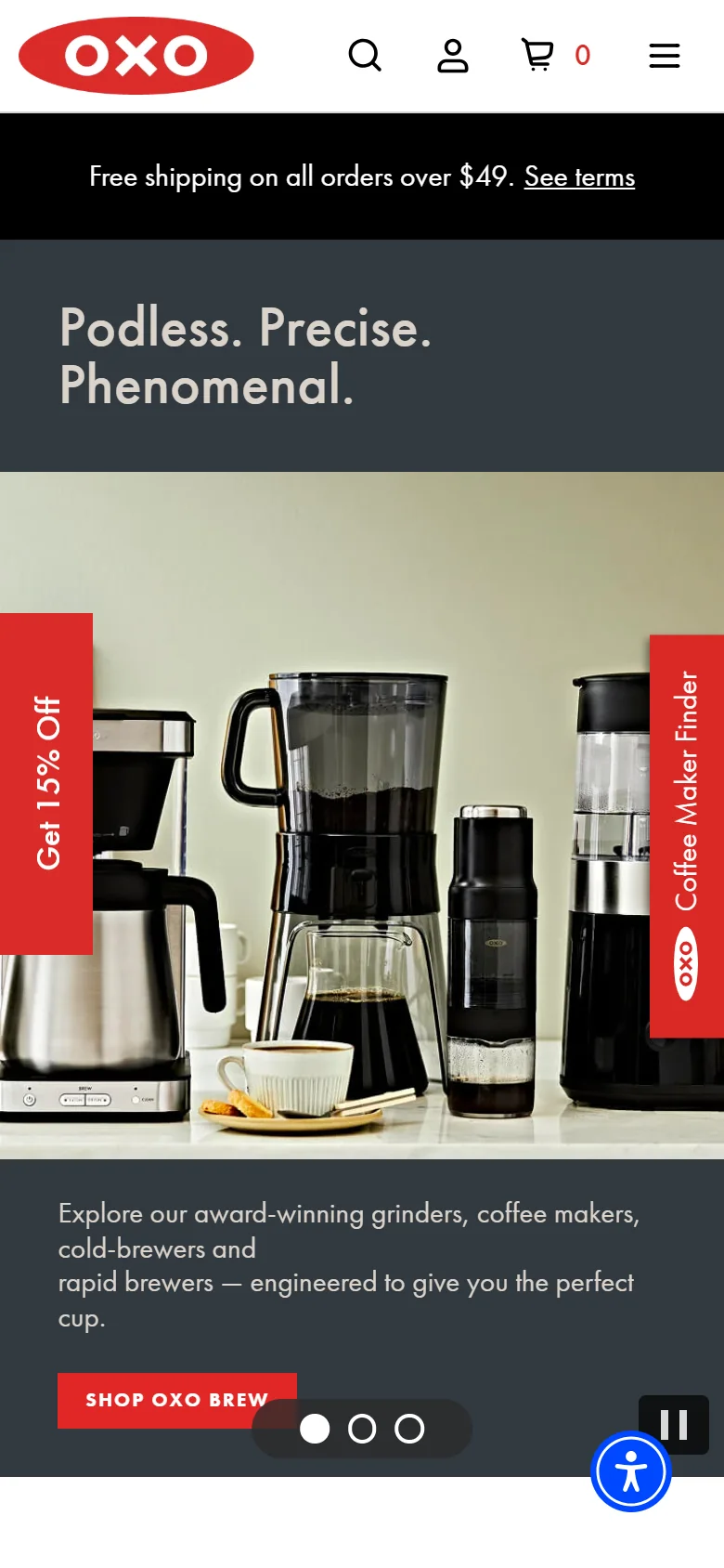

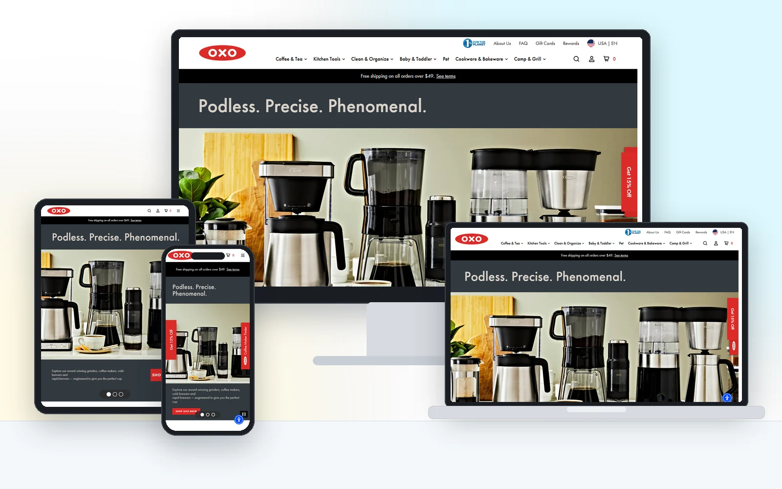
Hundreds of everyday products, presented so the right one is easy to find and the page never slows down.
The challenge
OXO sells hundreds of kitchen, home and baby products that people buy on trust and detail. The store has to carry a big catalogue without feeling like a warehouse, stay fast under campaign traffic, and keep the brand's clean look consistent across every collection and product page.
What we built
We worked on the storefront experience: collection and product page templates built around product photography and quick comparison, faceted filtering that narrows hundreds of items to a handful, and front-end performance work so pages stay quick on mobile during campaigns. Everything follows the brand's design system, so new products slot in without design debt.
The result
- Collection pages that stay fast with large product counts
- Product pages that answer the practical questions before the price
- One consistent design system across every category
- Front end tuned for mobile shoppers and campaign traffic
Desktop, laptop, tablet and phone
Real screenshots of the live site, not mockups. Every layout is designed for the small screen first, then scaled up.